
From Concept to Screen: The Design Process Behind My Geometry Wars-Inspired Game

Hi everyone, I’m Patricio from Weveana, an independent game developer from Ecuador. In this post, I want to share the full design journey of my new game: a top-down arcade shooter inspired by Geometry Wars, built specifically for web platforms like Poki, Crazy Games, and FRVR.
The Origin of the Idea
The project started with a clear goal — bring the fast-paced, neon-filled excitement of Geometry Wars to the browser. I wanted a game that was addictive, visually striking, and perfect for short play sessions on web platforms.
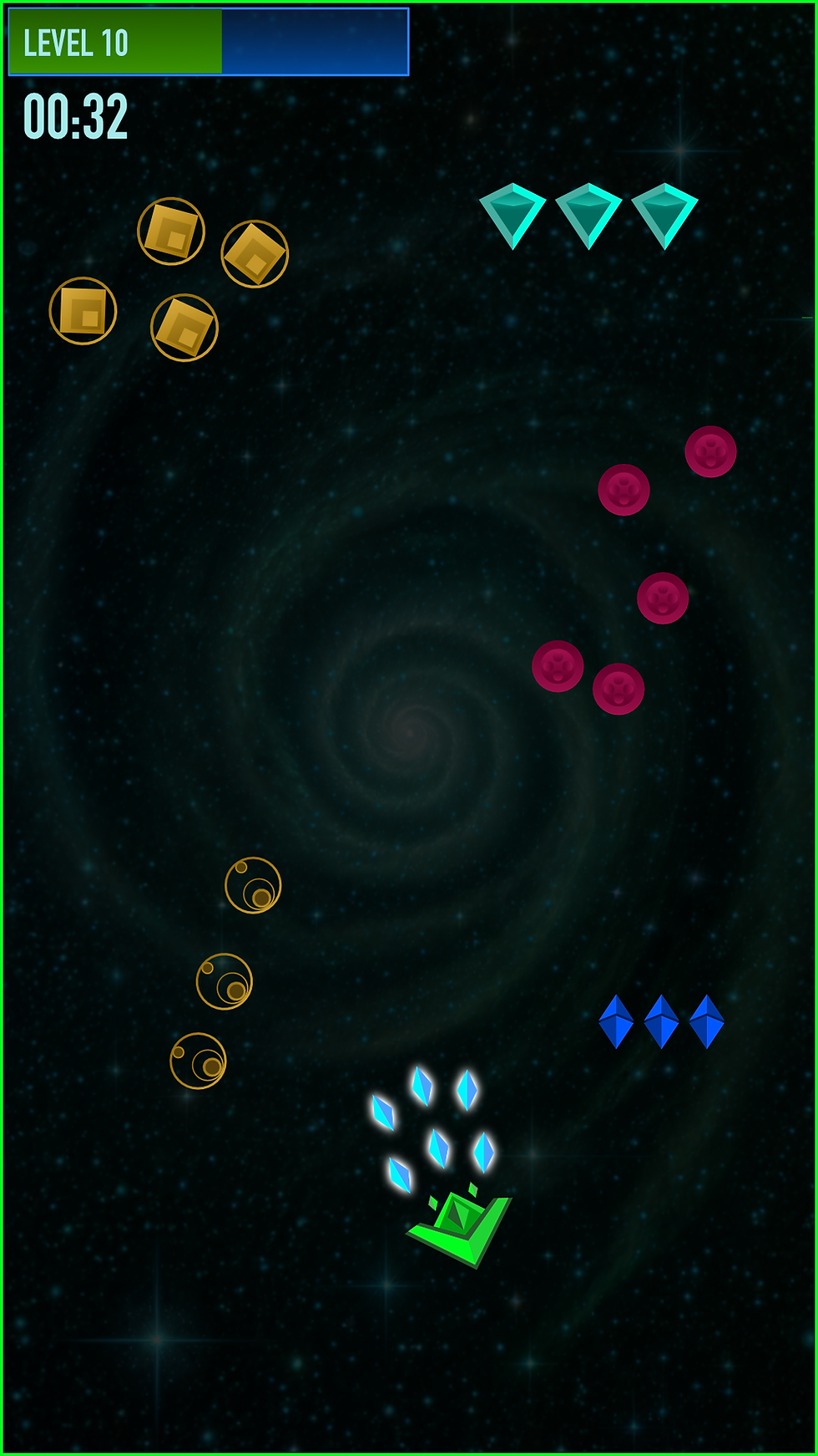
An Iterative Design Process
This game has been all about iteration and testing. We didn’t get it right on the first try. The process looked like this:
Started with basic concepts for the player ship and enemies.
Tested multiple visual directions (more cartoonish vs more premium neon).
Added depth with nebula backgrounds, foreground asteroids, and particle effects.
Constantly refined glows, shapes, colors, and overall balance based on how everything felt on screen.

Every change was reviewed, compared, and improved until we reached the current look.
Key Technical Decisions
Landscape orientation (1280x720) for the best web experience.
A neon geometric aesthetic that balances clean cartoon vibes with premium polish.
For physics, I’ll be exploring Box2D with Phaser to achieve precise collisions with irregular shapes.
Current State of the Design
After many rounds of iteration, the game now has a strong visual identity. Here’s the latest mockup:
(Insert your latest mockup images here)
What we have so far:
Main ship with personality and strong neon effects
Collectibles and enemy designs
Atmospheric background with parallax depth
Basic UI and particle systems

Next Steps
Now that the visual design is nearly finalized, I’ll move into the early development phase: implementing core mechanics with Phaser + Box2D, polishing explosions and effects, and starting proper gameplay testing.


I like games that leave a little room for curiosity, and this one seems to do that well. Instead of showing every possible feature at once, it td777 game online feels like there are things you can discover gradually. That makes the experience less predictable for me. The visual design is also simple enough to keep the focus on gameplay. I would definitely be interested in seeing what changes are introduced later because the foundation already seems interesting.
The content in this article is presented in a clear and understandable format. I liked how the writer begins with basic information and then moves toward more detailed points. This makes the post useful for people who are unfamiliar with the subject. The explanations are straightforward, and there is enough useful information without excessive repetition. I found the article helpful during my research and gained a better perspective on the topic https://www.bigmumbaie.net/ .
Jai Club has a fairly straightforward interface that I found easy enough to navigate. The website does not appear overly complicated, and the main areas can be identified without much effort. For visitors who are discovering the platform, this type of organization can be useful. A clean and simple layout makes it easier to explore without feeling confused or overwhelmed.
jai club
Excellent article with clear explanations and useful information. I appreciate the effort you invested in making every section meaningful. It’s always nice to come across content that answers questions directly without adding unnecessary details. I’ve bookmarked this page because I know I’ll come back whenever I need to review this topic again.
dhaniwingames.net
I was pleasantly surprised by how easy this article was to understand. The information was presented in a logical order, making the topic much less confusing. Thank you for taking the time to create such valuable content. Your effort is appreciated, and I hope you continue sharing more informative articles for readers like us in the future. delhi lakshmi yojana